Code
# read in data
# Source: https://www.kaggle.com/mczielinski/bitcoin-historical-data
dt_daily_close <- fread("./bitcoin-daily-close-2012-2020.csv")This post covers some of the basic strategies behind how (financial) time series are analysed and how volatility models work. In particular I examine the ARCH model. Don’t take the attempt to forecast the distributions of Bitcoin / US dollar price movements seriously - I would bet precisely $0 on this model! I hope to do a more detailed post on how to evaluate distributional forecasts in the future.
It’s January 2021 and Bitcoin price have been breaking all time highs. In this context I wanted to explore statistical methods for estimating and forecasting volatility, in particular autoregressive conditional heteroscedasticity (ARCH) models. Volatility is variation around the mean return of a financial asset. Low volatility implies prices are bunched near the mean (or trend) while high volatility implies large swings in prices. It is considered a measure of investment risk. For example, we may be convinced Bitcoin will continue to rise in value over the short term but reluctant to engage in speculation if there is significant volatility reducing our chances of being able to buy in and sell at “good” prices (even if there a upward trend). I’ll add I’m not an expert on financial markets, and that models and graphs below are coded in R.
# read in data
# Source: https://www.kaggle.com/mczielinski/bitcoin-historical-data
dt_daily_close <- fread("./bitcoin-daily-close-2012-2020.csv")To say the Bitcoin (BTC) price has been going up recently was probably an understatement, the price has gone up more 100% since the beginning of 2020! Although if we compare with previous bull market in late 2017 where the price went up more than 1000% it is not a unique occurrence in Bitcoin’s history. Indeed, looking at the graph of Bitcoin on a log scale below we see that the recent (relative) growth rate is comparatively low in Bitcoin’s history.
# graph bitcoin and log10(bitcoin) over time
p1 <- ggplot(dt_daily_close,aes(x=date,y=Close)) +
  geom_line() +
  theme_bw(base_size = 16) +
  labs(x="Year",y="US$",title="BTC price")
p2 <- ggplot(dt_daily_close,aes(x=date,y=Close)) +
  geom_line() +
  scale_y_log10() +
  theme_bw(base_size = 16) +
  labs(x="Year",y="US$",
       title=expression(paste("BTC price (",log[10]," scale)"))) +
  theme(plot.caption = element_text(hjust = 0,size=16))
gridExtra::grid.arrange(p1,p2)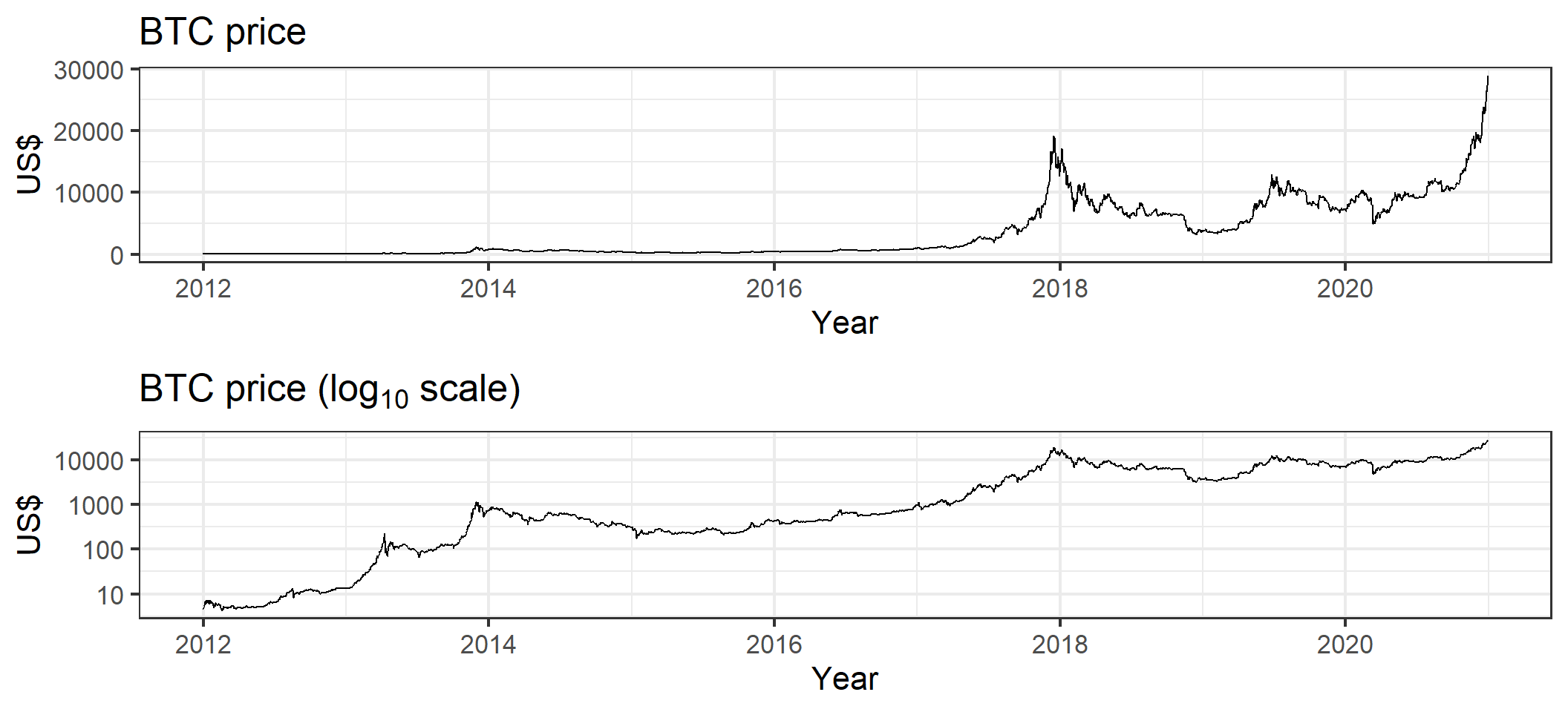
It is common in the statistical analysis of financial time series to transform the asset price in order to achieve something closer to a series of independent increments (a random walk). If \(B_t\) is the Bitcoin price on day \(t\), the daily “log return” is \(Z_t = log(B_t) - log(B_{t-1})\). Using the log differences might seem rather arbitrary at first but it can justified as 1) making a multiplicative process additive and 2) interpretable as the percentage change in asset value. If \(r_t\) is the return at time \(t \in {1,2,...,T}\) for a starting asset value of \(W_0\) then \(W_T = W_0\prod_{t=1}^T(1+r_t)\). Taking logarithms gives
\[\begin{align} log(W_T) &= log(W_0) + \sum_{t=1}^T log(1+r_t) \\ &= \underbrace{log(W_0) + \sum_{t=1}^{T-1} log(1+r_t)}_{log(W_{T-1})} + log(1+r_T) \\ log(1+r_T) &= log(W_T) - log(W_{T-1})\\ \end{align}\]
Further for small \(r_t\) the percentage price is approximately equal to the log return, i.e. \(log \approx x\). So the random-walk hypothesis hopes that the relative price changes are close to an independent process.
dt_daily_ret <- dt_daily_close[,.(return = diff(log(Close)))]
dt_daily_ret[,date := dt_daily_close$date[-1]]
We can see in the plot below that \(Z_t\) appears to be a zero mean process. However, comparing it to a simulated white noise process we see much greater variation in the magnitude of deviations from the the mean. The Bitcoin returns also exhibit clustering in their variance over time. These are characteristics the ARCH model was designed to account for.
# compared bitoin log returns to white noise
p1 <- ggplot(dt_daily_ret,aes(x=date,y=return)) +
  geom_line() +
  theme_bw(base_size = 16)+
  coord_cartesian(ylim=c(-0.7,0.7)) +
  labs(x="Year",y="Daily return",title="Bitcoin (US$)")
wn <- data.frame(date = dt_daily_ret$date,
                 wn=rnorm(nrow(dt_daily_ret),
                 sd=sd(dt_daily_ret$return)))
p2 <- ggplot(wn,aes(x=date,y=wn)) +
  geom_line()+
  theme_bw(base_size = 16) +
  coord_cartesian(ylim=c(-0.7,0.7)) +
  labs(x="Year",y="Daily return",title="White noise")  +
  theme(plot.caption = element_text(hjust = 0,size=16))
gridExtra::grid.arrange(p1,p2)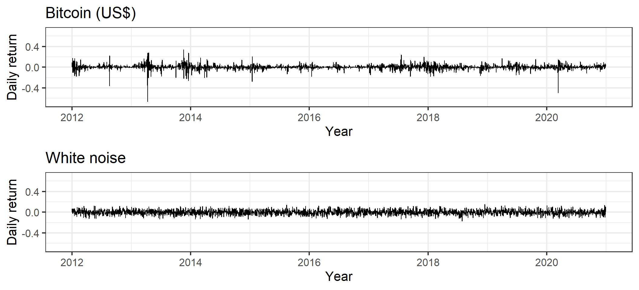
An alternative way to look at a times series is plots of the autocorrelation function (ACF) and partial autocorrelation function (PACF). The ACF graphs the correlation between observations at time \(Z_t\) and \(Z_{t-h}\) for various values of \(h\). Since we average over \(t\) we are assuming that the series is stationary - intuitively that it’s statistical properties don’t depend on \(t\). The PACF graphs the correlation between \(Z_t\) and \(Z_{t-h}\) with all intermediate values \(Z_{t-1},Z_{t-2},...,Z_{t-h+1}\) regressed out. Below are ACF and PACF graphs of the series \({Z_t}\) and \({Z_t^2}\). While \(Z_t\) appears to have relatively weak patterns the ACF and PACF of the \(Z_t^2\) process demonstrates clear dependence in the process variance.
# Create function to plot acf using ggplot2
ggacf <- function(acf_obj,y,title) {
  acfrdf <- with(acf_obj, data.frame(lag, acf))
  if(min(acfrdf$lag) == 1) {
    acfrdf <- rbind(acfrdf,data.frame(lag=0,acf=1.0))
  }
  ggplot(data = acfrdf, mapping = aes(x = lag, y = acf)) +
       geom_hline(aes(yintercept = 0)) +
       geom_segment(mapping = aes(xend = lag, yend = 0)) +
  theme_bw(base_size = 16) +
  labs(x = "Lag",y=y,title = title) +
  geom_hline(aes(yintercept = 1.96/sqrt(acf_obj$n.used)),
             linetype = 3, color = 'darkblue')+
  geom_hline(aes(yintercept = -1.96/sqrt(acf_obj$n.used)),
             linetype = 3, color = 'darkblue')
}

# ACF of returns
acfr <- acf(dt_daily_ret$return, plot = FALSE)
p1 <- ggacf(acfr,"ACF","Returns")

# ACF of returns^2
acfr2 <- acf(dt_daily_ret$return^2,plot = FALSE)
p2 <- ggacf(acfr2,"ACF","Squared returns")

# PACF of returns
pacfr <- pacf(dt_daily_ret$return, plot = FALSE)
p3 <- ggacf(pacfr,"PACF","Returns")  +
  theme(plot.caption = element_text(hjust = 0,size=16))

# PACF of returns^2
pacfr2 <- pacf(dt_daily_ret$return^2,plot = FALSE)
p4 <- ggacf(pacfr2,"PACF","Squared returns")


gridExtra::grid.arrange(p1,p2,p3,p4,ncol=2)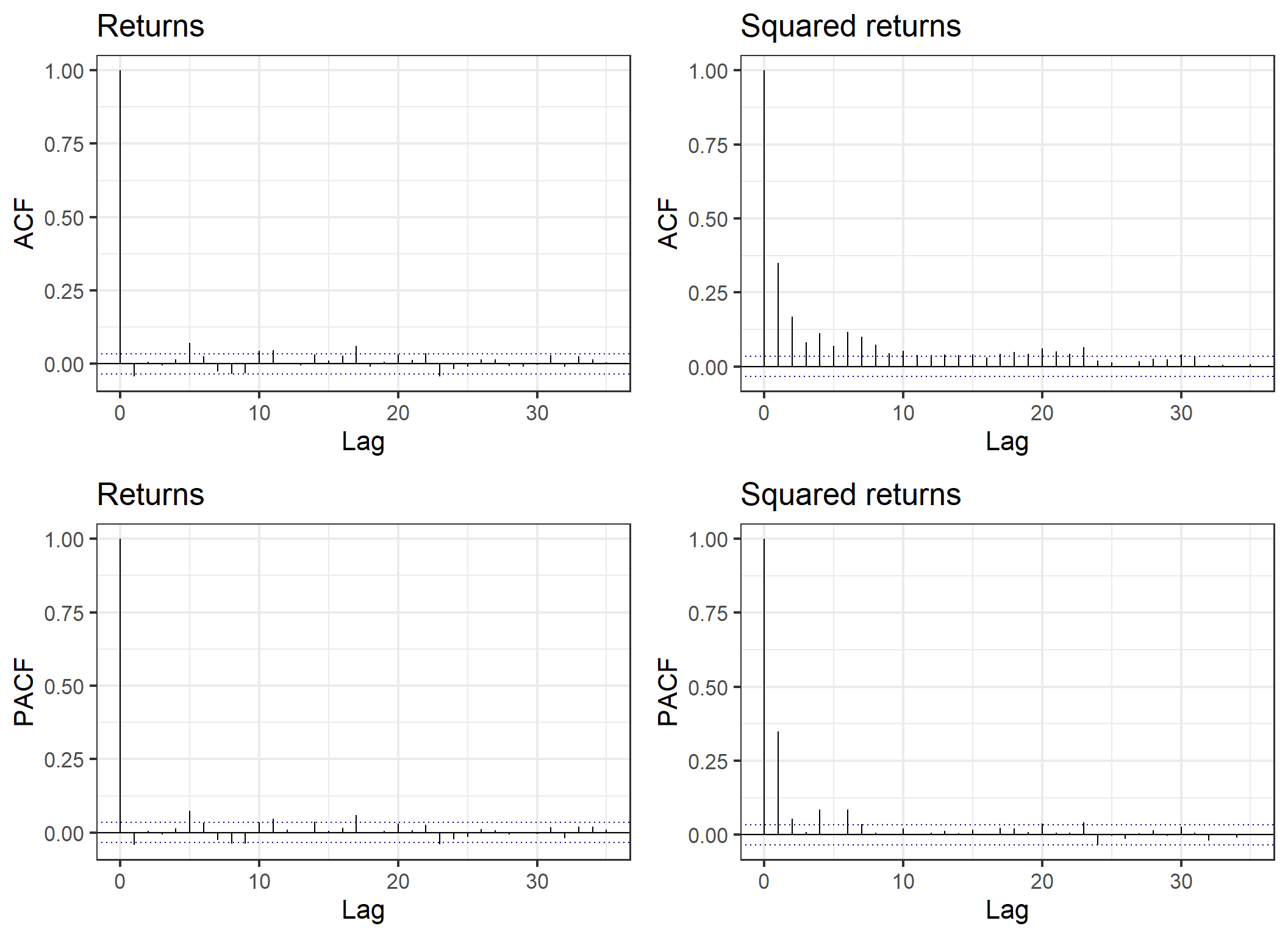
A formal test of independence of a time-series, the Ljung–Box test, strongly rejects independence in \(Z_t^2\) with a small p-value. We also reject independence of the \(Z_t\) increments but this is much weaker signal.
# test of Z_t
Box.test(dt_daily_ret$return,type = "Ljung-Box")
    Box-Ljung test

data:  dt_daily_ret$return
X-squared = 5.9396, df = 1, p-value = 0.0148# test of Z_t^2
Box.test(dt_daily_ret$return^2,type = "Ljung-Box")
    Box-Ljung test

data:  dt_daily_ret$return^2
X-squared = 399.32, df = 1, p-value < 2.2e-16
Autoregressive conditional heteroscedasticity (ARCH) models, developed by Robert Engle in 1982, were designed to account for processes in which the variance of the return fluctuates. ARCH processes exhibit the time varying variance and volatility clustering seen in the graph of Bitcoin returns above. An ARCH(p) series is generated as \(X_t = \sqrt h_t e_t\), with \(h_t = \alpha_0 + \sum \alpha_i X_{t-i}^2\) and \(e_t \sim N(0,1)\). There have been extensions to the model since 1982 with generalised ARCH (GARCH) and it’s various flavours (IGARCH, EGARCH, …) which allow more complex patterns such as somewhat “stickier” volatility clustering.
I always like to try and understand how a model works by either simulating form it (for statistical models) or using simulated data to understand it’s performance (for machine learning models). Lets simulate some examples of an ARCH(1) process to get an idea of how the simplest version of the process works.
simulate_arch1 <- function(a0,a1,n=1000L) {
  # function to simulate an ARCH(1) series
  # a0: ARCH constant
  # a1: ARCH AR term
  # n: length of time series
  xt <- numeric(length = n+1)
  ee <- rnorm(n+1)
  xt[1] <- ee[1]
  for (i in 2:(n+1)) {
    ht <- a0 + a1*xt[i-1]^2
    xt[i] <- ee[i]*sqrt(ht)
  }
  xt[2:(n+1)]
}# simulate an ARCH(1) series
set.seed(1)
arch1_plts <- vector(mode = "list",length = 4)
for (i in 1:4) {
arch1_sim <- data.frame(t=1:1000, xt=simulate_arch1(1.0,0.6))
arch1_plts[[i]] <- ggplot(arch1_sim,aes(x=t,y=xt)) +
geom_line() +
theme_bw(base_size = 16) +
labs(y=expression(x[t]))
}
gridExtra::grid.arrange(grobs=arch1_plts)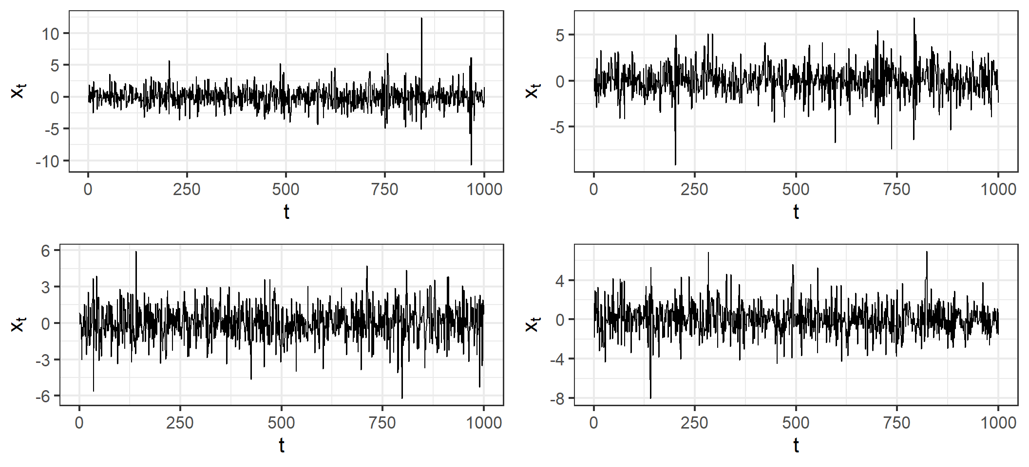
# ACF of returns
acfr <- acf(arch1_sim$xt, plot = FALSE)
p1 <- ggacf(acfr,"ACF",expression(x[t]))

# ACF of returns^2
acfr2 <- acf(arch1_sim$xt^2,plot = FALSE)
p2 <- ggacf(acfr2,"ACF",expression(paste(x[t]," squared")))

# PACF of returns
pacfr <- pacf(arch1_sim$xt, plot = FALSE)
p3 <- ggacf(pacfr,"PACF",expression(x[t]))

# PACF of returns^2
pacfr2 <- pacf(arch1_sim$xt^2,plot = FALSE)
p4 <- ggacf(pacfr2,"PACF",expression(paste(x[t]," squared")))

gridExtra::grid.arrange(p1,p2,p3,p4,ncol=2)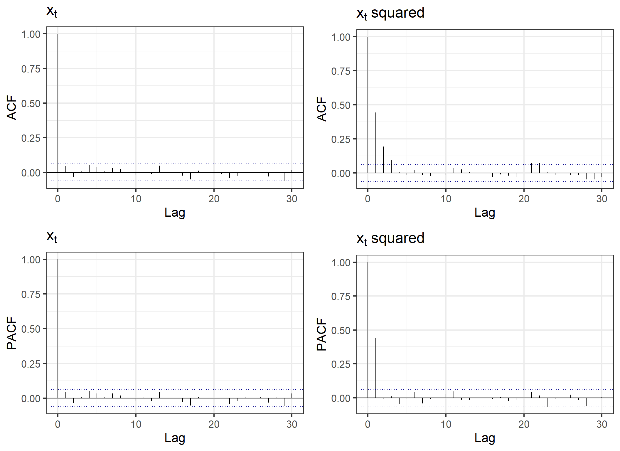
It is worth remembering that ARCH models are for the volatility, we can also have usual trends, or additional ARIMA components. For example, let’s simulate an AR(1) model with ARCH(1) volatility, \(X_t = u_0 X_{t-1} + \sqrt h_t e_t\). The plots of the ACF and PACF for this series shows similar correlation patterns for both \({X_t}\) and \({X_t^2}\).
simulate_ar1_arch1 <- function(u0,a0,a1,n=1000L) {
  # function to simulate AR(1) + ARCH(1) series
  # u0: autoregressive term
  # a0: ARCH constant
  # a1: ARCH AR term
  # n: length of time series
  xt <- numeric(length = n+1)
  ee <- rnorm(n+1)
  xt[1] <- ee[1]
  for (i in 2:(n+1)) {
    ht <- a0 + a1*xt[i-1]^2
    xt[i] <- u0*xt[i-1] + ee[i]*sqrt(ht)
  }
  xt[2:(n+1)]
}# simulate an AR(1) + ARCH(1) series
set.seed(1)
ar1arch1_plts <- vector(mode = "list",length = 4)
for (i in 1:4) {
ar1arch1_sim <- data.frame(t=1:1000, xt=simulate_ar1_arch1(0.4,1.0,0.6))
ar1arch1_plts[[i]] <- ggplot(ar1arch1_sim,aes(x=t,y=xt)) +
geom_line() +
theme_bw(base_size = 16) +
labs(y=expression(x[t]))
}
gridExtra::grid.arrange(grobs=ar1arch1_plts)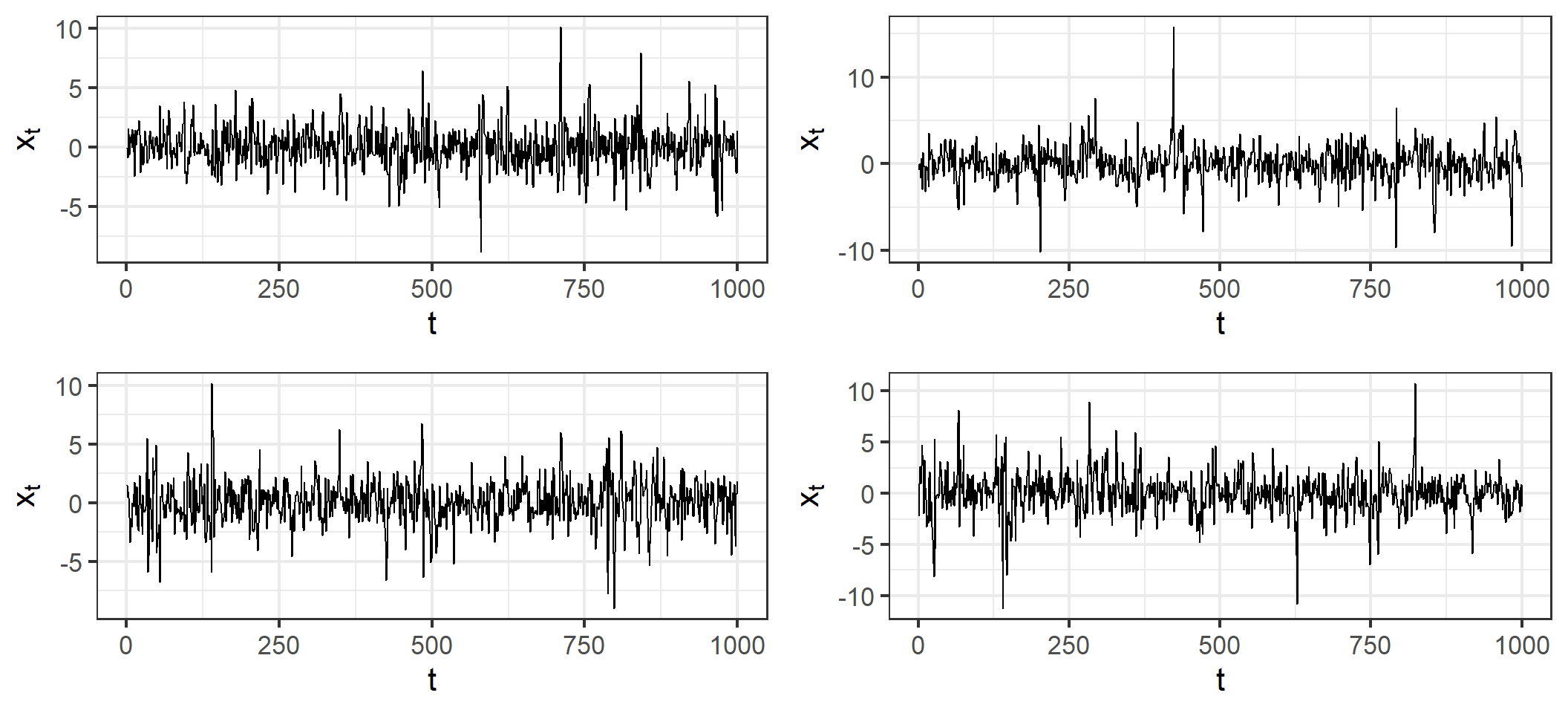
# ACF of returns
acfr <- acf(ar1arch1_sim$xt, plot = FALSE)
p1 <- ggacf(acfr,"ACF",expression(x[t]))

# ACF of returns^2
acfr2 <- acf(ar1arch1_sim$xt^2,plot = FALSE)
p2 <- ggacf(acfr2,"ACF",expression(paste(x[t]," squared")))

# PACF of returns
pacfr <- pacf(ar1arch1_sim$xt, plot = FALSE)
p3 <- ggacf(pacfr,"PACF",expression(x[t]))

# PACF of returns^2
pacfr2 <- pacf(ar1arch1_sim$xt^2,plot = FALSE)
p4 <- ggacf(pacfr2,"PACF",expression(paste(x[t]," squared")))

gridExtra::grid.arrange(p1,p2,p3,p4,ncol=2)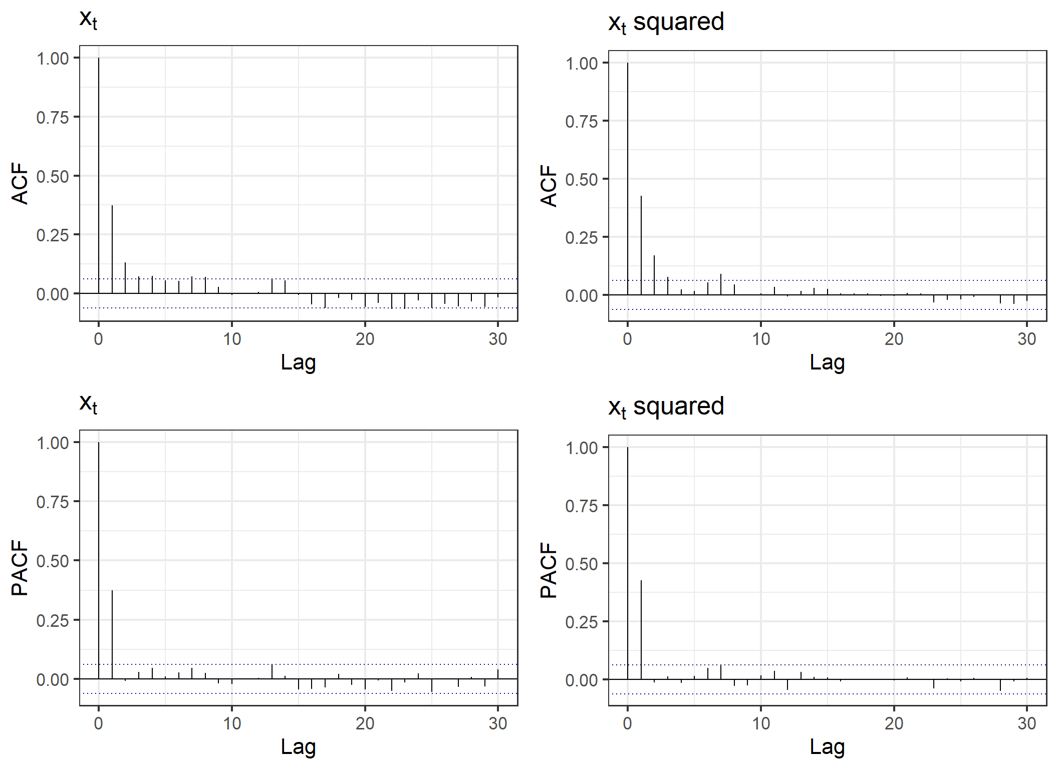
Now that we’ve got an idea of how ARCH models work let’s move onto modeling Bitcoin returns. We’ll use the R package fGarch which estimates the model parameters using Quasi-Maximum Likelihood Estimation. I picked an ARCH(2) model based on a quick comparison of model fit statistics for different values of the heteroscedasdicity order. The garchFit function prints a lot to the console which you can suppress with trace = FALSE.
# fit an ARCH(2) model to Bitcoin returns
library(fGarch)
m1 <- garchFit(~arma(0,0)+garch(2,0),dt_daily_ret$return,trace=FALSE)
summary(m1)
Title:
 GARCH Modelling

Call:
 garchFit(formula = ~arma(0, 0) + garch(2, 0), data = dt_daily_ret$return,
    trace = FALSE)

Mean and Variance Equation:
 data ~ arma(0, 0) + garch(2, 0)
<environment: 0x000001717ef5a620>
 [data = dt_daily_ret$return]

Conditional Distribution:
 norm

Coefficient(s):
       mu      omega     alpha1     alpha2
0.0026454  0.0010569  0.2509523  0.2539764

Std. Errors:
 based on Hessian

Error Analysis:
        Estimate  Std. Error  t value Pr(>|t|)
mu     2.645e-03   6.524e-04    4.055 5.02e-05 ***
omega  1.057e-03   3.843e-05   27.502  < 2e-16 ***
alpha1 2.510e-01   2.827e-02    8.878  < 2e-16 ***
alpha2 2.540e-01   3.296e-02    7.704 1.31e-14 ***
---
Signif. codes:  0 '***' 0.001 '**' 0.01 '*' 0.05 '.' 0.1 ' ' 1

Log Likelihood:
 5898.152    normalized:  1.796027

Description:
 Wed May 14 09:16:33 2025 by user: z5110862


Standardised Residuals Tests:
                                   Statistic      p-Value
 Jarque-Bera Test   R    Chi^2  5.872749e+04 0.0000000000
 Shapiro-Wilk Test  R    W      8.800888e-01 0.0000000000
 Ljung-Box Test     R    Q(10)  2.637818e+01 0.0032635002
 Ljung-Box Test     R    Q(15)  3.905686e+01 0.0006284357
 Ljung-Box Test     R    Q(20)  4.941103e+01 0.0002687776
 Ljung-Box Test     R^2  Q(10)  1.415062e+01 0.1662317732
 Ljung-Box Test     R^2  Q(15)  1.871180e+01 0.2270918171
 Ljung-Box Test     R^2  Q(20)  2.063043e+01 0.4191643780
 LM Arch Test       R    TR^2   1.536772e+01 0.2219403242

Information Criterion Statistics:
      AIC       BIC       SIC      HQIC
-3.589618 -3.582192 -3.589621 -3.586959
Calling summary on the resulting model object returns estimates of the model parameters and Ljung–Box statistics for the residuals and squared residuals. The model returned is \(Z_t = 0.00265 + \sqrt h_t e_t\) with \(h_t = 0.001 + 0.251 Z_{t-1}^2 + 0.254 Z_{t-2}^2\). Notice that the Ljung-Box test is significant for the residuals but not squared residuals. The p in Q(p) of the Ljung-Box test results indicates the extent of the autocorrelation lag used in testing for independence of the residuals. So there is evidence of unaccounted for correlation in the data when considering lags up to 15 and 20. However, the ACF and partial ACF suggest that the remaining auto correlation is somewhat complex and weak enough to ignore for the purposes of illustrating basic volatility forecasting with ARCH model.
One use of such a model may be to forecast the one day ahead distribution of returns. Our forecasts are of the form \(Z_{t+1} \sim N(0,\hat{\alpha}_0 + \hat{\alpha}_1 Z_{t-1}^2 + \hat{\alpha}_2 Z_{t-2}^2)\). These forecasted distributions can be used to assess the probability of price movements of a particular size. Since we might believe the parameters of the model are not constant I’ll use a rolling forecast window of 300+1 days. So starting at day 301 (2012-10-26) until the final day 3,285 (2020-12-31) I’ll fit an ARCH(2) model to the previous 300 days and forecast forward one day. We can see in the results that there is considerable room for improvement, the model fails to capture many of the large price movements, but that it is not producing complete nonsense either.
# forecast bitoin returns using a rolling ARCH(2) model
dt_daily_ret$meanForecast <- NA
dt_daily_ret$meanError <- NA

# this takes a while
for (i in 1:(nrow(dt_daily_ret)-300)) {
  model <- garchFit(~arma(0,0)+garch(2,0),dt_daily_ret$return[i:(300+i)],trace=FALSE)
  pred <- predict(model, n.ahead = 1)
  dt_daily_ret$meanError[i+300] <- pred$meanError[1]
  dt_daily_ret$meanForecast[i+300] <- pred$meanForecast[1]
}

# some limits
dt_daily_ret$upperLimit99 <- dt_daily_ret$meanForecast + dt_daily_ret$meanError*qnorm(1-0.01/2)
dt_daily_ret$lowerLimit99 <- dt_daily_ret$meanForecast - dt_daily_ret$meanError*qnorm(1-0.01/2)
dt_daily_ret$upperLimit80 <- dt_daily_ret$meanForecast + dt_daily_ret$meanError*qnorm(1-0.2/2)
dt_daily_ret$lowerLimit80 <- dt_daily_ret$meanForecast - dt_daily_ret$meanError*qnorm(1-0.2/2)
dt_daily_ret$upperLimit50 <- dt_daily_ret$meanForecast + dt_daily_ret$meanError*qnorm(1-0.5/2)
dt_daily_ret$lowerLimit50 <- dt_daily_ret$meanForecast - dt_daily_ret$meanError*qnorm(1-0.5/2)# graph performance of rolling forecast
dt_daily_ret$outside <- NA
dt_daily_ret$outside <- 1*(dt_daily_ret$return > dt_daily_ret$upperLimit99 |
dt_daily_ret$return < dt_daily_ret$lowerLimit99)
ggplot(dt_daily_ret) +
geom_ribbon(aes(ymin=lowerLimit99,ymax=upperLimit99,x=date),fill="steelblue2",alpha=0.5) +
geom_ribbon(aes(ymin=lowerLimit80,ymax=upperLimit80,x=date),fill="steelblue3",alpha=0.5) +
geom_ribbon(aes(ymin=lowerLimit50,ymax=upperLimit50,x=date),fill="steelblue4",alpha=0.5) +
geom_line(aes(x=date,y=return)) +
coord_cartesian(xlim=c(as.Date("2019-01-01"),as.Date("2020-12-31")),
ylim=c(-0.5,0.25)) +
geom_point(data=dt_daily_ret[dt_daily_ret$outside==TRUE],
aes(x=date,y=return),col="red")+
geom_point(data=dt_daily_ret[dt_daily_ret$outside==TRUE &
dt_daily_ret$return > dt_daily_ret$upperLimit99],
aes(x=date,y=upperLimit99),col="blue")+
geom_point(data=dt_daily_ret[dt_daily_ret$outside==TRUE &
dt_daily_ret$return < dt_daily_ret$lowerLimit99],
aes(x=date,y=lowerLimit99),col="blue")+
labs(x="Date",y="Bitcoin daily return") +
theme_bw(base_size = 16)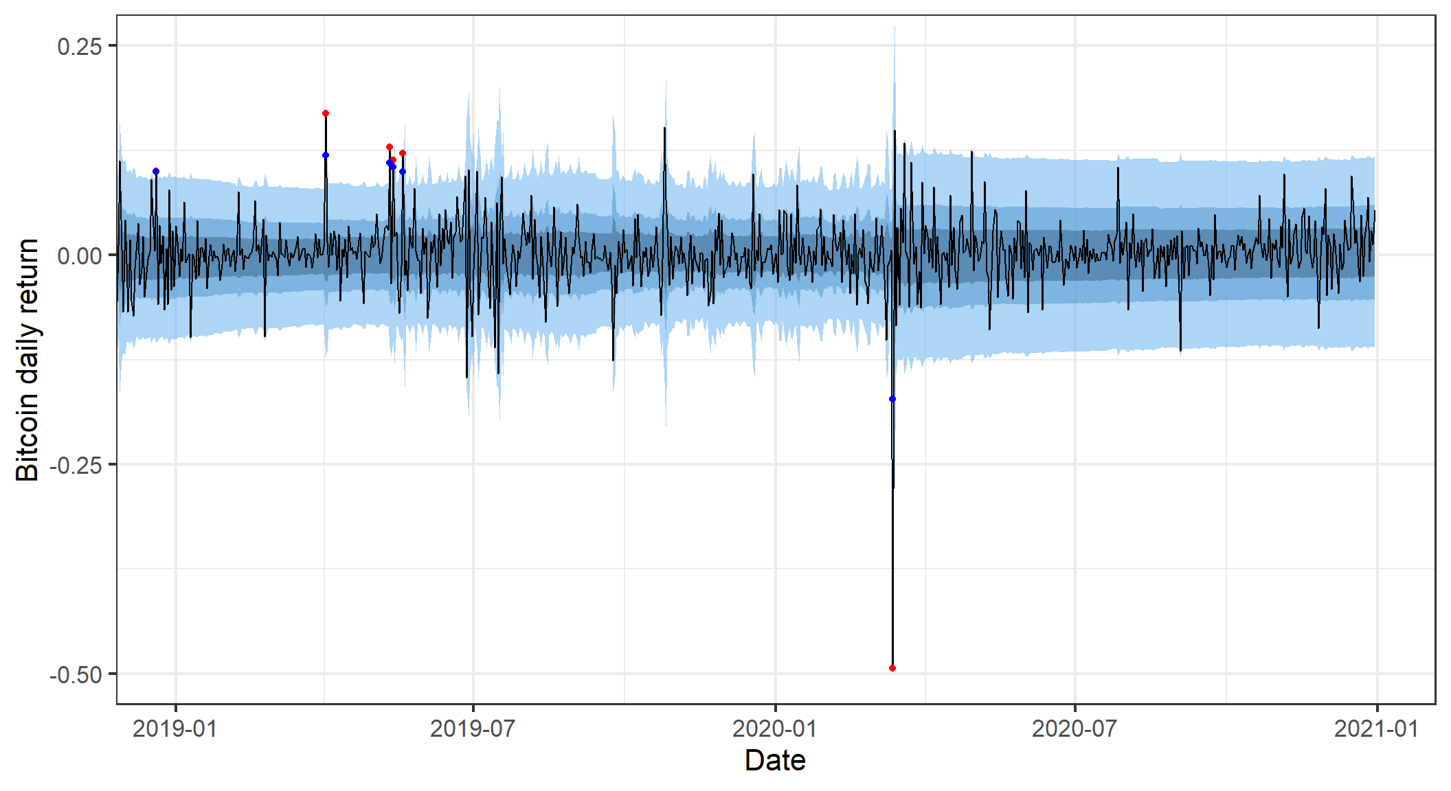
A more thorough evaluation of the forecasts involves assessing their calibration and dispersion (I won’t go into details on this aspect, see for example Gneiting and Katzfuss (2014)). From the graphs below we see that our forecasts are poorly calibrated - the forecasted probabilities of price movement are not reliable. They are likely to over estimate the probability of a large price movement (overdispersion).
# cumulative probability forecasts
dt_daily_ret$probForecast <- pnorm(dt_daily_ret$return,mean = dt_daily_ret$meanForecast,sd = dt_daily_ret$meanError)

# PIT
p1 <- ggplot(dt_daily_ret) +
  geom_histogram(aes(x=probForecast,y=..density..),col="white",fill="lightblue") +
  theme_bw(base_size=16) +
  labs(x="Forecast probability")


# calibration
dt_daily_ret$probForecastInt = ceiling(dt_daily_ret$probForecast*20)/20
calib_tab <- dt_daily_ret[,.N,by=.(pred=probForecastInt)][order(pred)]
calib_tab <- calib_tab[!is.na(pred)]
calib_tab[,cumN := cumsum(N)]
calib_tab[,obsp := cumN/sum(N)]
calib_tab[,obsp_sd := sqrt(obsp*(1-obsp)/N)]
calib_tab[,obsp_lower := obsp-2*obsp_sd]
calib_tab[,obsp_upper := obsp+2*obsp_sd]


p2 <- ggplot(calib_tab) +
  geom_pointrange(aes(x=pred,y=obsp,ymin=obsp_lower,ymax=obsp_upper)) +
  geom_abline(slope = 1,intercept=0,linetype=2,col="blue")+
  geom_line(aes(x=pred,y=obsp))+
  labs(y="Observed relative\nfrequency",x="Forecast probability")+
  theme_bw(base_size=16)

gridExtra::grid.arrange(p1,p2,ncol=2)
Warning: The dot-dot notation (`..density..`) was deprecated in ggplot2 3.4.0.
ℹ Please use `after_stat(density)` instead.`stat_bin()` using `bins = 30`. Pick better value with `binwidth`.Warning: Removed 300 rows containing non-finite outside the scale range
(`stat_bin()`).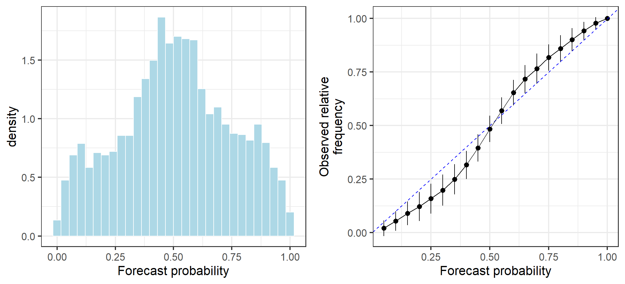
We might wonder whether the poor performance came about due to the large drop in March 2020 influencing future predictions. However, this doesn’t appear to be the case. The prediction strategy I used is simply not good!
# PIT
p1 <- ggplot(dt_daily_ret[date < "2020-03-01"]) +
  geom_histogram(aes(x=probForecast,y=..density..),col="white",fill="lightblue") +
  theme_bw(base_size=16) +
  labs(x="Forecast probability")

# calibration
calib_tab <- dt_daily_ret[date < "2020-03-01",.N,by=.(pred=probForecastInt)][order(pred)]
calib_tab <- calib_tab[!is.na(pred)]
calib_tab[,cumN := cumsum(N)]
calib_tab[,obsp := cumN/sum(N)]
calib_tab[,obsp_sd := sqrt(obsp*(1-obsp)/N)]
calib_tab[,obsp_lower := obsp-2*obsp_sd]
calib_tab[,obsp_upper := obsp+2*obsp_sd]


p2 <- ggplot(calib_tab) +
  geom_pointrange(aes(x=pred,y=obsp,ymin=obsp_lower,ymax=obsp_upper)) +
  geom_abline(slope = 1,intercept=0,linetype=2,col="blue")+
  geom_line(aes(x=pred,y=obsp))+
  labs(y="Observed relative\nfrequency",x="Forecast probability")+
  theme_bw(base_size=16)

gridExtra::grid.arrange(p1,p2,ncol=2)
`stat_bin()` using `bins = 30`. Pick better value with `binwidth`.Warning: Removed 300 rows containing non-finite outside the scale range
(`stat_bin()`).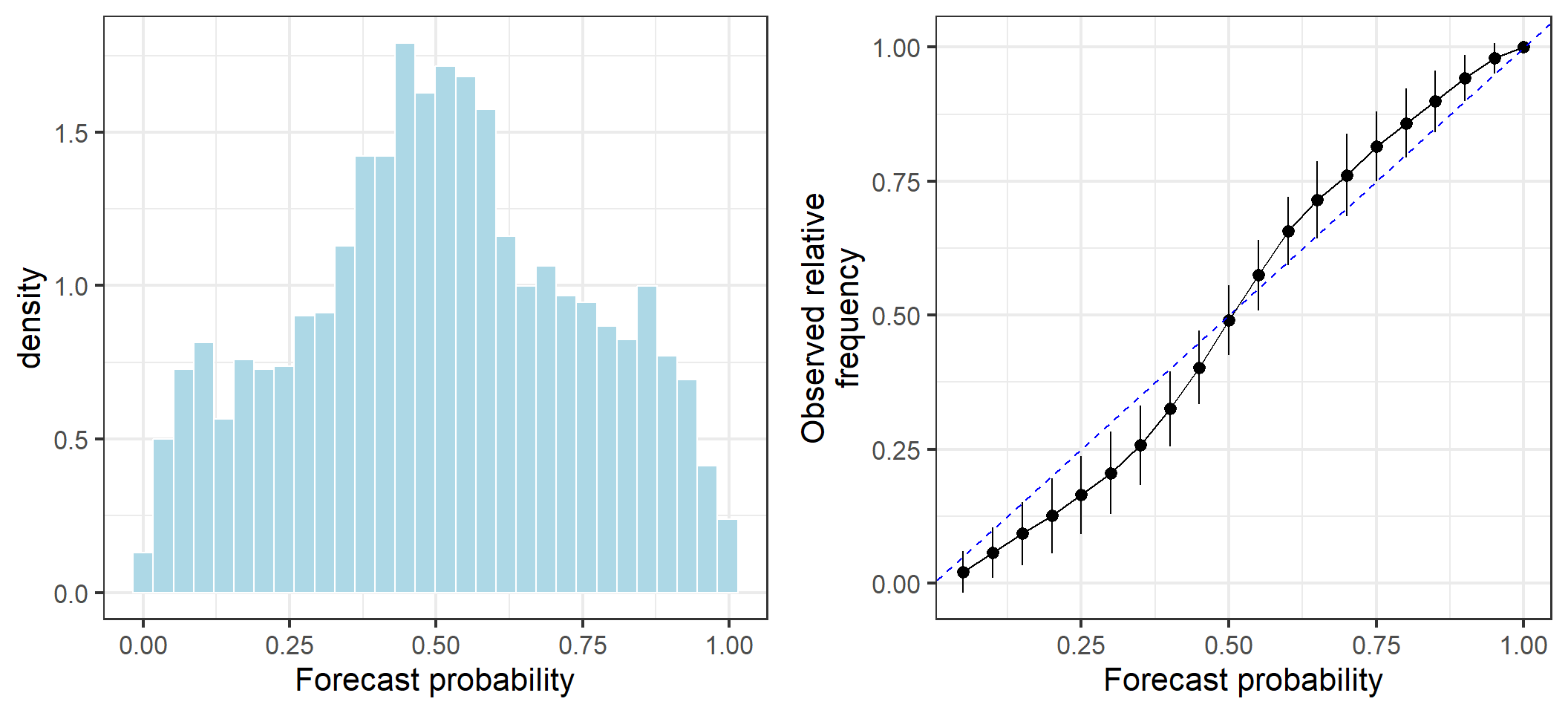
Thanks for reading. This was a relatively simplistic introduction to the use of ARCH models for forecasting volatility in the Bitcoin market. ARCH models allow the variance of time series at time \(t\) to depend on the variance of previous terms \({t-1,t-2,...}\), analogous to how autoregressive models. This allows us to forecast distributions of future prices in a manner that is more reflective of empirical observations of financial time series.